Choose materials for life beyond the photograph
Think about touch, light, cleaning and ageing alongside colour. A small sample strategy can make a palette much more useful.
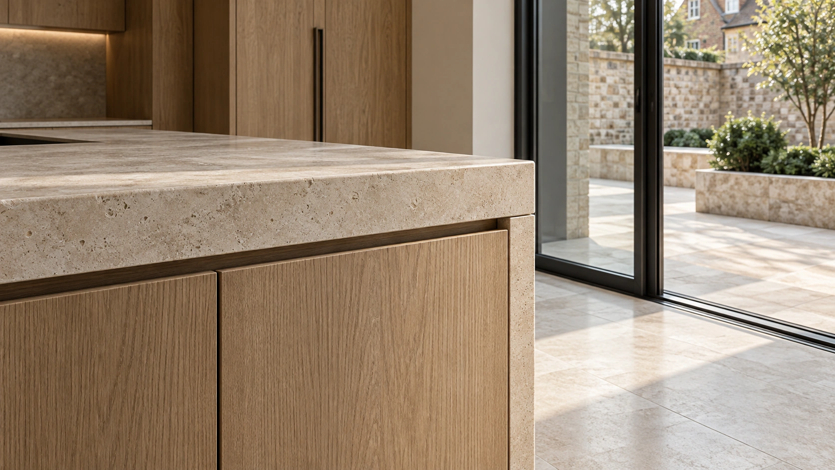
Start with where and how it will be used
Describe the conditions before choosing a finish. Will the surface be walked on with wet shoes, touched repeatedly, used for food preparation or exposed to strong sunlight? A material that suits a quiet bedroom may need a different specification at a commercial entrance. Decide what matters most in each location, then discuss suitable options with suppliers and the relevant specialists. A visual preference is a useful starting point, but it should develop alongside information about performance, preparation, maintenance and installation. Keep these questions attached to the sample, not in a separate forgotten list.
Look at samples together, in context
Gather samples of the main surfaces and view them beside one another in the actual space where possible. Look in daylight and under the proposed artificial lighting, rather than relying on a screen or a showroom alone. Notice sheen, texture and the way edges meet as well as colour. Small samples may not show the variation of timber, stone or patterned products, so ask how representative they are. Photograph and label the combinations you like, but make the final assessment with physical information appropriate to the intended use.
Ask about ageing and maintenance
Some surfaces develop a patina that people enjoy; others require regular attention to retain their original appearance. Ask what routine cleaning involves, which products should be avoided and whether local repairs are possible. For a business, consider the time and access available for maintenance during a normal working week. For a home, consider how the household actually lives rather than an idealised routine. A material choice becomes more convincing when its expected changes are understood and accepted, rather than discovered after installation. Record care information with the final selection.
Use fewer decisions more deliberately
A coherent palette does not require every surface to match. It needs a clear relationship between the elements that are visually dominant and those that provide a quieter background. Decide where a more characterful material will have the greatest effect, then use simpler choices elsewhere. Review joins, corners, thresholds and transitions as part of the composition. Before ordering, confirm dimensions, quantities, delivery periods, installation requirements and the actual product specification. Concept images and material names describe a direction; they do not replace that final coordination.
Zink field notes · 23 October 2026 · General project guidance; the brief and site conditions need individual review.